Benchmarks
This is a Club Prophet Executive Report v4 – Power BI or PBI. .
Note: Samples are using demo data and do not reflect real world data.

The Benchmarks report shows today’s revenue and quantities of sales and rounds vs. a data range of the same information broken out into the industry benchmarks such as Green Fee, Cart Fee, Range, Merchandise, F&B, Lessons, Membership, and Other. This lets you compare what is going on today vs. the overall date range.
A lot going on here so zooming in on the data:

To break down each visual
Total Revenue with Industry Category Totals and Per Round (Today vs. Filter Date Range)
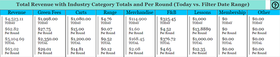
This first group of visuals show the current $$ Amount for Today and the $$ Amount Per Round for total Revenue and then a breakdown for each industry category, as well as the Total $$ Amount and Total $$ Per Round amount based on the Date Filter.
In the first example above under Revenue, today (real time), we have generated $4523.11 in Revenue. This is $62.82 per round (today’s revenue divided by today’s number of rounds). For the Date Range we have generated $5,104.69 which comes to $63.02 per round.
Note: This is demo data so it does not reflect real life numbers.
The rest of the visuals going across (From Green Fees thru Other) show the breakdown of that Revenue for each Industry Category segment.
That Question Mark icon in the top right opens this user guide in a browser.
Note: Make sure you include today’s date in the Date Filter or you will not see today’s data.

In this example, three are listed under Open Tabs for a total of $13.23 in the system. You will also see the Total Tabs for the date range. The Total Tabs which are the Amount and the Qty, match today’s numbers which is good. If there were more tabs in Total that would indicate that you have old tabs that were not closed prior to today.
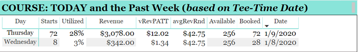
This visual shows the course data for the current week including today. The default sort is descending starting with today. So, today will be in the first row.
In this example:
For Thursday (today), there were 72 rounds sold listed under Starts of 256, listed under Available and 72 booked, listed under Booked which computes 28% utilization (Utilized) generating $3,078.00, listed under Revenue which computes $12.02 of revenue per available tee time, listed under vRevPATT and $42.75 average revenue per round, listed under avgRevRnd.

This is the date filter for the overall data for the report. Again, include today’s date or you will not see any of the data for today .
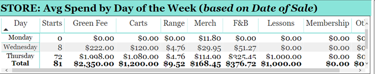
This will show the average amounts by the day of the week for each industry category along with the number of rounds (Starts). You would compare the Thursday line to the Today numbers in the other visuals to see how you are doing vs. an average Thursday. Use the vertical and horizontal scroll bars to scroll to other days and other categories. You can also zoom-in by clicking this icon in the top-right of the selected visual:

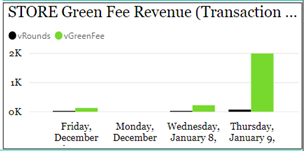
This is simply a graph showing Qty Sold and Revenue Generated for Green Fees for the given date range.

This visual shows the per round amounts by the day of the week for the given industry categories. Again, you would compare the Wednesday line against the numbers of today to see how you are doing on a per round basis. This is often more meaningful than comparing total dollars as it basis everything purely on “per round” rounds. This is a more realistic comparison as it would eliminate external variables like good vs bad weather.
So, to pull it all together, you can for example compare your per round numbers across the date range to today by comparing the circled numbers below regardless of the total revenue numbers:

You can then quickly look for variances on a per round bases to analyze significant differences, either positive or negative. For example, why are the lessons up by over $7 per round? While you can’t tell from here, it will lead you to see that a $1,000 lesson package was sold today.
Of course, you can do the same with revenue today vs. average revenue for Thursday but keep in mind external factors may influence those numbers. The number of rounds will give you a clue if there are external factors to consider. In this example, there were 72 starts today vs. an average Thursday where there were 316 average starts. When the number of rounds varies significantly it could be weather related, or maybe course conditions from maintenance or a prior few days of rain.
For each visual, there is an icon with three dots […] that you can click for more options. You need to select the desired visual to see these controls.
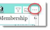
These options include things like See Data, Export Data (to Excel), Sort options, etc.
FILTERS
There are various filters you can use to narrow down the data. Filters are the gold background controls as well as the Filters right hand sidebar.

Tips
- Filters which are the gold back color controls on the report allow you to pick from a list. Hold down the Ctrl key on the keyboard to select multiple items.
- If you want to search for a particular value, use the filters in the right pane menu. They will have a search box in addition to a list of the items.
- Use the Advanced option in the right menu panel for advanced search options.
- Use the three dots […] in the top right of a visual for more options like Export data.

- Use the Help button to open the user guide for any given report
 .
.