Rev Year Comparison
This is a Club Prophet Executive Report v4 – Power BI or PBI.
Note: Samples are using demo data and do not reflect real world data.
Rev Year Comparison
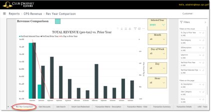
The Revenue Per Year Comparison report shows the revenue for a given year by month/year (MMYYYY) and compares this to the same period for the prior year in the clustered bar chart. The overlaying line chart shows the percent change between the two years.
Note the Y Axis for the bar bhart is on the left while the Y Axis for the line chart is on the right.
In this example we are showing the data for the Year 2020 and the report date is 2/11/2020. In January the Total Pre-Tax Revenue is down just slightly from the prior year. In February it is down significantly but we are not even half way thru the month yet.
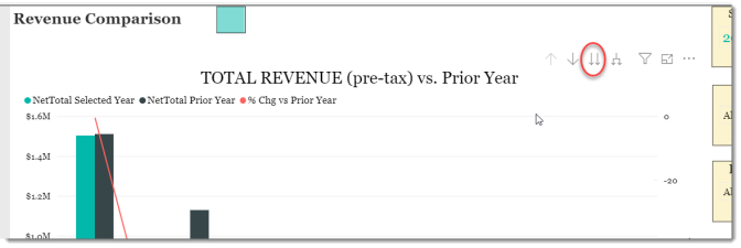
Using the Drill-Down controls you can also view this data by GL-Code and Sale Category:
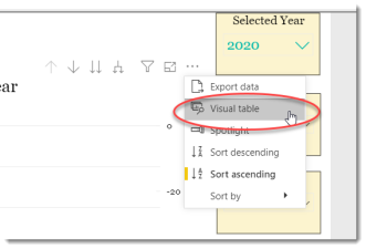
Another useful tool from the […] control which is especially good for graphs that span large values is Visual table:
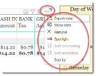
This will show you the actual values for each data point as follow:
FILTERS
There are various filters you can use to narrow down the data. Filters are the gold background controls as well as the Filters right hand sidebar.
Tips
- Filters which are the gold back color controls on the report allow you to pick from a list. Hold down the Ctrl key on the keyboard to select multiple items.
- If you want to search for a particular value, use the filters in the right pane menu. They will have a search box in addition to a list of the items.
- Use the Advanced option in the right menu panel for advanced search options.
- Use the three dots […] in the top right of a visual for more options like Export data.
- Use the Help button to open the user guide for any given report
 .
.


